
A short city break: London
- Nov 17, 2017
- 9 min read
A break from pottery but not from ideas or other artistic input. This three day trip included visits to four different museums and one concert. I may have squeezed in a bit more in if I had been there on my own. Instead I enjoyed good food and the company of my mother and a friend. So, here is a quick(ish) summary:

NPA: Cézanne Portraits
First on the list was the National Portrait Gallery and the exhibition of portraits by Cézanne. I have previously seen an exhibition of his work, which concentrated mainly on his still lives and landscape paintings and must admit that he is not one of my favourite artists. But I'm always open to be corrected especially as I wasn't aware of his portraits.
Going around and looking at there portraits I learnt something new about me. I had not realised that I am not really that interested in portraiture as genre unless I am interested in the persons depicted. Then I will engage in the depiction of the sitter and am interested in the facial expression, the posture and the psychology of a painting. Otherwise, instead of concentrating on the faces I tend to look at general painterliness of a painting such as colour, rhythm and composition and texture.

This was the my favourite portrait of the exhibition. What dominates is the composition with strong contrasting dark and light areas and the rhythm and angle of the books. I also liked his colour palette with the grey blues and browns contrasting against the strong oranges. I have no complaints about the painting of the man himself but find his surroundings more interesting.
All the paintings that appealed to my mother, who is really into portraiture, were the ones I least liked. Instead the groups portraits where Cezanne painted the sitter repeatedly were the ones which caught my attention. Individually each painting may not be that strong but as a group they gained more significance through comparison like these portrait of his wife.

[Note to self: Groups of art/pottery pieces make more impact and add context for each individual piece.]


The following day I spent considerable time looking around the Victoria & Albert Museum. It must be about 25 years ago since my first and only previous visit.
Rather than trying to cover the lot I decided to concentrate on their ceramics collection and, if time permitted, to take in their Japanese, Chinese and Islamic rooms.
What an absolute treat: great pieces presented in a beautiful environment and so very few people there but so, so many pots. Obviously there is no way one to take it all in.

Thus, in the historical ceramic section I decided to concentrate on Chinese, Middle-Eastern and English slipware pottery.
Chinese pottery:
This time I didn't concentrate as much on their Celadon ware pottery but picked out some of their more colourful ceramics such as these:


I though theis cup and vase from the Qianlong period (1736-95) made for the imperial court showed how elegantly stylised floral decorations were combined with elegance of form and strong colours. They really have a timeless elegance.
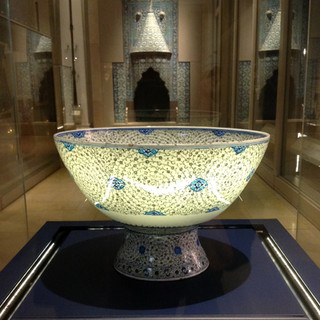
As part of my research I am fascinated by the influence different cultures had on each other's pottery production. This was partly because people appreciated the beauty and sophistication of another countries wares. Sometimes, they were just fascinated by the novelty look of the pottery which was possible because of new technological developments in pottery production. Quite often the reason for incorporating other culture's design aesthetics was purely mercenary as adapting one's own pottery production could open up new lucrative markets. These two bowl with Arabic inscriptions and 'magic square' motif were produced ca 1770-95 by the Chinese for the Asian market.

What I have also noticed that certain simple geometric patterns seem to be nearly universal regardless of country of origin. These red patterns can also be found on Iznik and Pueblo Indian ceramics. These pots from the Shunzi period (1644-61) are examples of early enamelling. I think their colours are very similar to the earlier Iznik pottery.

Iznik pottery:
Below is only a fraction of what is on show and I was nearly totally overwhelmed by the number of pots. Because there are so many quite a few good examples are shelved away. One needs to be make special prior arrangements to see those. However, there is still so much to see.

I did have my suspicion that I may actually not like Iznik pottery that much when I see it for real. However, I shouldn't have worried. There was pottery from many other countries on show (such as Spain or Italy) which I really didn't like the look of in quantities because they were either too mannered or to garish. Iznik pottery just stays on the right side of colourful and decorative. This is probably because most colours used are primary colours with a dominance of cobalt blue (one of my favourite colours anyway). The colours seem very clean and clear on the white background. There are really no yellows, oranges or pinks.

The tiles, which are a major use of Iznik ceramics stick to the same colour palette.

I sometime wonder how I would feel like in a building completely covered with these patterns and colours. Would it be too much?

English slipware pottery:
This is really quite a shift in aesthetic perception from all the Middle Eastern pottery. Instead of concentrating on patterns I am now looking at the quality of glaze in its most toffee like qualities. I am really trying to like and appreciate old English lead glazes. I am slowly coming around to them but enjoy their use in contemporary ceramics far more than the 'old' pots.


20th century pottery:
There are too many real treats in the 20th century/contemporary sections to list them here. On a very personal note it was a real pleasure to see some of the pottery I grew up which includes Ulla Procope's brown tableware and her blue 'Valencia' range both for Arabia, Finland or the black and white with gold pottery designed by Piero Fornasetti - all designed about 1960.


All these are an example of the kind of ceramics my grandmother liked and sold through her interior design shop during that time. She was a real champion of contemporary design and also of crafts, including studio pottery.
Contemporary Ceramics:
This display in the circular room was impressive. An artist really knows they've made it if they are included here. Each artist is represented with just one statement piece. It was good to see Halima Cassell in the company of the likes of Edmund de Waal or Kate Malone.


What was remarkable that none of these pieces of ceramics were functional but all were sculptural and they were are big. I get the impression if you want to be taken serious as a ceramic 'artist' size definitely matters. So, my intention of building at least one large piece seems to be good idea. I guess making clay sculptures allows one's work to cross over into the 'art' category and as such can demand higher sales prices than purely functional wares. Hah, here is me dreaming...
Contemporary Korean pottery: The last room was showcasing contemporary ceramics from Korea from both established and emerging makers. Even though they were all very different what was noticeable was the level of craftsmanship and finish. All of the ceramics on show were very polished in their own way.
Even though nothing radically new I was impressed by the calm beauty of Yoon Sol's slipcast porcelain dishes and sculptures. In a way they only work because of their perfection in finish.

In stark colour contrast to Sol's white pieces were the Yun Jucheol's brightly coloured pieces. They reminded me of glass work. These too exquisitely finished.

With the exception of Kim Jeree's sinking house, of which we saw a larger version of at the Biennial in Stoke, I was missing a bit of 'roughness' that indicated that these ceramics were handmade. Jeree's ceramics stand out as they are more conceptual and use the material clay in a very temporal form as it isn't fired and is in the process of disintegration to make a statement about Korea.

When looking at these two large pots by Yoo Euijeong was reminded of a comment Dave Binns, our course leader, made a in connection with my pottery in which he encourages me not to be afraid of straying into kitsch.

Quite often 'decorative' and 'kitsch' can be found in close aesthetical proximity. As I am whole heartedly embracing the decorative qualities of the decorative elements to my pottery I should not be astonished to find myself potentially straying into the land of kitsch. This is making me feeling slightly uncomfortable as kitsch, for me, has always had connotations of tastelessness saccharine brashness. I know kitsch can be employed in a humourous way but I've often thought that consciously using kitsch in an ironic way only badly masks a strong sense of sentimentality which is not implicit in 'decorative'. I also think that I was raised with the notion of art and commercial success often being on opposing sides, i.e. commercially successful art having sold out and loosing its authenticity. This is an age old dilemma and itself steeped in the kitsch notion of the impoverished artist's genius only being discovered posthumously. Something I'm not aspiring to - in any sense except that some form of recognition would be nice especially if it brings in some money during my life time. Well, as said kitsch is something that I am wary of. That may also be part of the reason why I find Jeff Koons and his art so objectionable - and this is a very unreflective emotional response. I deeply distrusts his art - the epitome of kitsch - and his commercial approach to art production. I think I am quite conservative in thinking that art needs to involve the hand of the artist, who is a master of his/her craft and is to some extent physically involved in its production.
Ground floor:
I was back on safer ground when I visited the Chinese, Japanese and Islamic Middle Eastern rooms in the V&A. Again, too many wonderful items to even attempt to do justice as part of this blog. I was particularly taken by the Iznik items displayed as they showed that the decorative qualities are not limited to their ceramic wares. Here just a few of my top examples:


This visit to the V&A was far too short and I'm planning to go again. Brilliant place!
RA: Jasper Johns


The Jasper Johns exhibition at the Royal Academy may not be immediately relevant to my own ceramic work but it was still interesting and you never know where you get ideas from. Anyway, I knew from previous visits to museums that I liked his use of colour as for instance on his target or number paintings. However, what I hadn't been aware of was the way Johns uses of multiple panels which he assembles and combines into one large painting. This adds an extra dimension to his work. To me it suggests that his works couldn't be contained by one canvas but other being added later on give it a temporal dimension of the making process. Or in the case of 'Painting with Two Balls' (1960) drawing attention to the painting as an object in its own right and not, as it has been traditionally, merely functioning as a means to carry a representation of something.

I am not really interested in his sculptural work but liked the sculptural elements added to his flat canvasses such as the little ledge on 'Watchman' (1964) which holds a paint covered ball propping up the piece of wood, which Johns presumably used to create the horizontal smear.

If any of his works bear a relevance to my pottery work it would be his cast Numbers series in bronze or aluminium. His early number paintings already appeal to my sense of colour and pattern such as 'Small Numbers in Colour' (1959). But his later metal cast versions have a much more industrial quiet beauty which relies on relief patterns and cast shadows.


I have just recently started to think of either finding some examples of universal signs which I could included into my personal pattern library or symbols from which I could create patterns. Islamic Art has integrated Arabic lettering when incorporating passages of the Quran into their art. Other alphabets would lend themselves to pattern making as well. However, they have cultural boarders imbedded in them as they only relate to a certain group of language users. I had considered international shipping flags as possibility. Looking at Johns' 'Fragment of a Letter' (2010) has given me the idea that depiction of sign language could also be a possibility. However, I am aware that there are different sign language dialects or even languages and that I would have to heavily abstract the pictures of the hands to come up with a useable pattern for my purposes. We'll see whether this is something to follow up...
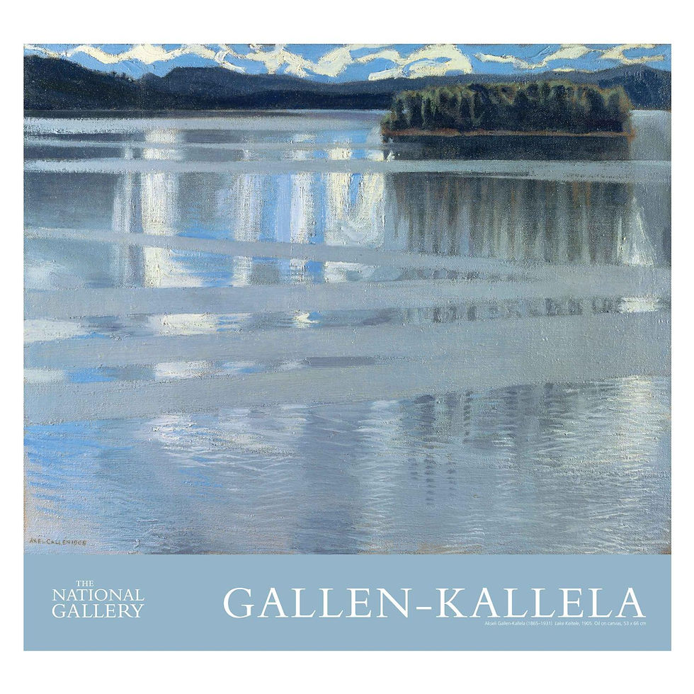
To round up my visit to London I finished with an hour in the National Gallery. I go there whenever I am in London. This way I can concentrate just on very few work of art each time but get to know the collection over the years. However this time, beside visiting some of my favourite paintings I also had a look around the special exhibition of Finnish Artist Akseli Gallen-Kallela (1865-1931) showcasing his painting of Lake Keitele.
This was a great and restful way to finish of this short break to London. Thanks, mother & friend.


Comments